About
Author
My name is Yixin Wang (Rae), a Master of Journalism student at the University of Hong Kong. My work focuses on data-driven storytelling, global affairs, and migration reporting.
This project analyzes global patterns of Afghan refugee and asylum seeker movements from 2019 to 2024 using R and tidyverse tools.
Statement on AI Use
I used generative AI tools in parts of this assignment. Below is a full and transparent documentation of how AI assisted my work.
AI Tools Used
ChatGPT (GPT-5.1)
Purpose / Specific Parts Where AI Was Used
ChatGPT assisted me in the following areas:
Debugging R code that failed to run
Troubleshooting map-related errors (e.g., map didn’t show up)
Improving visualization styling (titles, labels, legends)
Checking and correcting grammar mistakes
Writing the Q4 map visualization code after having trouble
I independently performed:
All data import, exploration, filtering, and cleaning
Writing initial code for Q1–Q4
Creating line charts and bar charts before seeking help
Structuring the entire Quarto project and narrative flow
All final edits and interpretation of findings
For Q4, I really wanted to understand the geographic distribution for Q4, so I read the textbook section several times and then wrote my own code based on it. before I used any AI tools, I first followed the example in the textbook, 10.3 Data Visualization → Map Plot: Life Expectancy by Country in 2022, and tried to adapt the code to my own dataset. The code ran without showing any errors, but the map never appeared in the output. I tried several times to adjust the join, the color scale, and the geom_sf() layer, but I still could not produce a map.
After repeating these attempts, I asked ChatGPT to help me identify what was going wrong and provide the correct code.
Prompt 1
“为什么这个code是对的,但是没有map出来”
AI Response 1
做地图必须多做两步
Step 1:加载世界地图(课程里没有教 sf,但 rnaturalearth 可以用)
library(rnaturalearth)
library(rnaturalearthdata)
library(sf)

world <- ne_countries(scale = "medium", returnclass = "sf")
这个 world 就包含 geometry 列。
Step 2:将 refugee 数据和世界地图 merge
因为你要让每个国家的 asylum seeker 数值跟地图连起来:
map_2024 <- world |>
  left_join(asylum_2024, by = c("name" = "country_of_asylum"))
现在 map_2024 同时有:
每个国家的 geometry
asylum seeker 数值
geom_sf() 现在才能工作
Step 3:地图终于能画出来了
map_2024 |>
  ggplot(aes(geometry = geometry, fill = total_asylum_seekers)) +
  geom_sf() +
  scale_fill_gradient(low = "white", high = "#3182bd", na.value = "grey90",
                      name = "Asylum Seekers") +
  labs(title = "Afghan Asylum Seekers by Country in 2024",
       fill = "Asylum Seekers",
       caption = "Source: UNHCR | Author: yixin") +
  theme_void() +
  theme(
    legend.position = "bottom",
    legend.title = element_text(size = 10),
    plot.title = element_text(hjust = 0.5, size = 11)
  )
Prompt 2
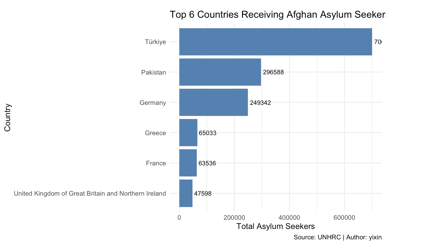
第一行的数字没有显示完怎么办
AI response 2
你的数字被截断,是因为 条形太长,标签被挤到图外面。
解决办法有三种,你任选一种即可。
方法 1:把数字放在条形“里面”而不是外面(最常用)
geom_text(aes(label = total_refugees),
          hjust = 1.1,   # 让文字往条形内部移动
          color = "white",
          size = 3)
如果你原来有 geom_text,把它替换即可。
方法 2:增加右边的绘图空白空间加入:
coord_cartesian(clip = "off") +
theme(plot.margin = margin(r = 40))   # 给右边多留一点空间
这样数字就不会被图框截掉。
方法 3:在 geom_text 里手动调节 nudge_x
geom_text(aes(label = total_refugees),
          nudge_x = 200000,   # 往右推一点
          size = 3
你可以调大或调小这个数字,直到看起来合适为止。